Quick! How long does the average recruiter look at your resume? One minute? One hour?
That’s not a lot of time to impress a recruiter and get that interview.
Fortunately, there are some things you can do to maximize those six seconds. And, it starts with proper resume formatting.
While there are lots of cool templates you can use to create your resume, a cool template may not be the right choice for you.
In fact:
A cool template may be the whole reason you don’t get an interview.
How a Resume Helps You Get the Interview
Your resume is your brief but formal introduction to the company. It helps them understand who you are as a potential employee and tells the story about all you’ve accomplished so far.
But here’s its goal:
Your resume should do more than highlight your skills and abilities. It should make the employer say,
How can you make your resume do that?
Well, you could be like this job applicant who created candy bar resumes.
Or
You could create a resume out of legos.
Then there’s this guy…
who created a video resume.
These are all amazing, creative, out-of-the-box ideas. And, as someone who used to do the hiring, I will happily admit that if you sent me your resume in candy bar form, I’d hire you on the spot.
But, not everyone has the resources, skill level, or even the time to pull these kinds of things off. And, that’s OK. These kinds of approaches aren’t for every applicant. Or even every employer.
Here’s the good news:
A traditional resume will still get the job done.
However, traditional doesn’t mean stuffy or boring. Think of a traditional resume as something familiar. Like a comfortable pair of pants. Consequently, traditional resume formatting is something that most recruiters are expecting, even hoping for.
The bottom line is:
It makes their life easier, making it more likely you get the interview.
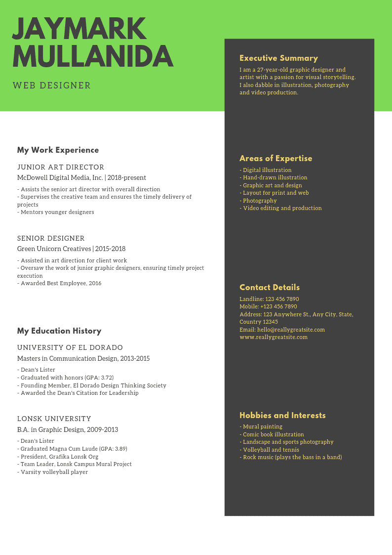
Traditional resumes don’t have to be boring. It can be more than just words on a page that summarize your work history. But first, you have to figure out which kind of resume formatting works for you.
via GIPHY
There are three basic styles of resume formatting:
Each resume style has its pros and cons. And some styles are better and worse for certain applicants.
via GIPHY
Resume Formatting Basics
Most resume formatting is similar.
No matter what resume style you choose, understand that basic resume formatting should look kind of like this:
- Contact Information
- Objective/Headline
- The Meat
- The Potatoes
Now, let’s figure out what resume formatting style works best for you.
Chronological Resumes
Chronological resumes list your work history in reverse chronological order. This is the most common resume formatting that job seekers use.
In fact, it’s so common that:
It’s pretty much what your LinkedIn profile is. It’s something you can be sure the recruiter will be comfortable with, even if they’ve already seen 100 of them that day.
Chronological resume formatting
In this style, the “meat” is the first section of your resume, appearing just underneath your contact information. If you have a headline or objective section, your work history comes under that.
In any resume formatting, it’s helpful to start each section with a header.
The header calls out what the recruiter can expect to see in each section of your resume.
In this resume style, you’ll call the header for this section “Employment History,” or “Experience.” Just make it clear that this is the section that talks about your past jobs.
via GIPHY
This is important:
Make sure it’s clear that you’re talking about paid work. Volunteer work or other special activities should have their own sections.
Generally, when you use this resume formatting, you list the name of the company, dates of employment, your job title, then your specific duties, like so:
Experience
The Widget Corporation: January 2017 – Present
Head Widgeteer
- Made widgets
- Inspected widgets for problems
- Made sure widgets were awesome
As you can see, it’s pretty straightforward and easy to read. That’s one of the reasons why it’s so popular. Chronological resume formatting is easy to create and easy for reviewers to scan for your career highlights.
Don’t forget the “extras”
After you’ve covered your work history, you can add as many other headers as you need with as many other “things” as you need. You can put in volunteer work, activities (if you’re still a student), honors, achievements, or special certifications.
via GIPHY
But remember:
Make sure you follow the same format you used for your job history. It keeps things “the same” and makes it easier for the recruiter to scan.
Volunteer Experience
The Pet Shelter: July 2016 – present
Volunteer
- Clean out cages
- Walk dogs
- Change water for cats
Activities
National Honor Society: March 2014
Spanish Club: August 2013 – present
- Vice-President: 2014
As you can see, it follows a similar pattern to the sample work history. Whatever you pick, be consistent. The formatting at the top of your resume should match the formatting at the bottom of your resume.
via GIPHY
Who should use a chronological resume
Almost any job seeker can use this style of resume formatting. However, this style is generally better for people with more than one job under their belts.
That said, people with only one job or even no job history can still use chronological resume formatting. You just have to think creatively.
Take this, for example:
If you’re still in college, list off any leadership positions you’ve had and treat those as jobs. Just make sure you make it clear that you’re listing off activities and not work experience.
via GIPHY
It might look like this:
Leadership Experience
Model UN Club: 2016 – present
President: 2018 – present
- Scheduled all meetings
- Increased student engagement by 68%
- Led team to two regional victories
Who should skip a chronological resume
While a chronological resume is suitable for almost any job seeker, you may want to consider avoiding it if you have large gaps in your work history.
This isn’t because you’re hiding the gap in your work history. You may have a perfectly good reason for a large gap. Maybe you had kids, and you’re reentering the workforce. Or, you had to move a lot.
via GIPHY
The truth is:
Whatever the reason, you don’t want a large gap in your work history to hold you back.
It might. It might not.
But, you want your resume to get you in the door, not tossed in the trash.
Not only that:
Also, consider skipping the chronological resume if you’re making a career transition. Resume info needs to be relevant.
Skill-Based
A skill-based resumes highlight your skills, not your work history. That’s not to say your work history isn’t important.
via GIPHY
It is, but here’s the deal:
This type of resume formatting places the spotlight on everything you’ve learned. And, it gives you the opportunity to explain how what you’ve learned will translate to the job you’re applying for, even when it isn’t obvious.
Resume formatting for a skill-based resume
Skill-based resumes are a little trickier to format. That’s because it forces you to think about what you learned, not necessarily when you learned it.
On top of that:
You’ve got to explain how what you’ve learned will benefit the employer.
The top part with your contact information is the same. Ditto for an objective or headline. And, you’ll still put education, volunteer experience, and other stuff at the bottom.
The diff comes in the middle.
Instead of starting with your job history, you start with your skills history.
via GIPHY
The point is:
You’re showing the employer that you’ve got all these great skills that they can take advantage of the second they hire you.
In general, you will group your skills by skill set and set them off by headers. It might look something like this:
Software skills:
- Trello
- Slack
- G Suite
- Microsoft products
If you want to highlight certain skills more than others, you might state your proficiency level:
via GIPHY
Software skills:
- Proficient with project management tools like Trello and JIRA
- Proficient with communication tools like Slack and Google Hangouts
- Experienced with G Suite products
- Familiar with Microsoft products
In both of these examples, you’re showing off your software skills. However, in the second example, you’ve highlighted your skill level.
And why wouldn’t you?
This lets the employer know that you’ve got a broad range of skills, but have more experience with some products than others.
via GIPHY
Of course, the above example deals with hard skills, and those are easy to quantify. What about soft skills?
Quantifying your soft skills
In the case of soft skills like communication or teamwork, you’ll need to do more than say “I can communicate.” You’re not only pointing out that you communicate, but you’re also quantifying how well you communicate.
Check these out:
Communications Skills
- Interfaced with customers daily
- Answered incoming support questions
- Worked as part of a team
That’s nice. But what does it mean for the employer?
Not much.
Try this:
Communications Skills
- Worked with customers daily to resolve their issues and help them have a positive experience to help build customer loyalty
- Crafted personalized responses to incoming support questions that satisfied the customer’s needs and solved their problems
- Worked as part of a fully-distributed team using Slack for synchronous and asynchronous communication
Which candidate are you hiring?
The challenge here is:
You’re grouping your skills by skill set. You’re not tying it to a specific job like you would with chronological resume formatting.
So, you have to explain what the skill is and how you used it. Consequently, this kind of resume formatting isn’t about the cool jobs you’ve worked; it’s about the cool skills you’ve gained.
via GIPHY
After you’ve highlighted your skills, do this:
List off your work history in a similar style to a chronological resume. Then list anything else you want.
Who benefits from using a skill-based resume
This type of resume formatting is best for anyone who wants to highlight their skills over their work history. It helps recruiters focus on what you’ve learned, not where you learned it.
This one is great for:
People with large gaps in their work history. It’s also good for people who’ve worked a lot of temporary jobs for short periods.
Also, if you’ve jumped around from industry to industry (say, social worker to dude ranch manager), this is the resume format for you.
via GIPHY
Who shouldn’t use a skills-based resume
There’s really no group that should avoid this style of resume formatting.
But, take note:
Some employers might be suspicious that you are trying to hide something if you use a skill-based resume.
The Combo Platter
Want the best of both worlds?
We all do.
Consider using a combination resume that’s both chronological and skills focused.
Formatting a combination resume
You’re going to take one from column A and one from column B.
Seriously.
In combo resume formatting, you take the best of both styles and make them into one big resume. Usually, they start with the skills-based half; then you transition to the chronological half.
Like so:
Skills
- Communication Skills
- Proficient with Slack for asynchronous communication
- Interfaced regularly with customers to help solve customer problems and create brand loyalty
- Software Skills
- Proficient with project management tools like Trello and JIRA
- Proficient with G Suite products
- Familiar with Microsoft products
Experience
- Widget Company: January 2017 to present
Line operator
- Worked on widget line
- Inspected and made widgets
Awesome Town: May 2016 – August 2016
Temporary Sales Associate
- Worked for the summer helping customers
- Rang up sales, made change, processed credit card charges
via GIPHY
As you can see, you’re covering all your bases. You’re talking about all the awesome skills you picked up at your jobs then explaining a little more in depth what you did at the job.
In addition to that:
You’re being honest about the fact that you don’t have a long or traditional work history.
Who wouldn’t want to hire that person? Honest and skilled? Count me in.
Who should use a combo resume
But (because there had to be a but):
In some fields, a combo resume (or even a skill-based one) will not be looked on favorably.
While you can’t always know, there are some employers and some fields that will only accept traditional resume formatting. Anything else will be tossed in the no pile.
Make It Pretty
All right. You’ve figured out the right resume formatting style for you and perfected what each entry is going to say.
Now, you need to make it look pretty.
You want the recruiter to remember your name, so maybe a cursive font, right? And, you like color, so maybe your name is in rainbow because that will totally make you stand out. Cool?
Remember:
The person reading your resume may have looked at, like, a jillion, of these already. Their eyes are tired, and they just want to get this hiring cycle over with.
Frankly, they hope the next frog they kiss turns into a prince (or princess).
You want to be that frog.
But you’re not going to do it with hard to read fonts and technicolor words.
Trust me.
As someone who’s looked at a jillion resumes, you want your resume to stand out because of your skills, not because of your fancy, so-hard-to-read-it-gave-me-a-headache font.
No matter what resume formatting style you pick, it needs to follow a few simple rules.
Keep it simple
via GIPHY
Believe it or not, less is more on a resume. You should limit the entire resume to one page. For those of us with slightly longer work histories, two pages if fine.
Keeping that in mind:
If you find you’re running out of space, combine a few bullet points into one bullet point. Or, delete awards, activities, or even volunteer work.
Remember, this is a snapshot of your skills and your history. Not your whole biography. Save some things to discuss during the interview.
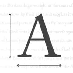
Pick the right font
Cursive, curly fonts are fun. So are calligraphy-like ones and handwriting-like ones. But, they are hard to read.
This applies to humans and machines alike (more on this later).
via GIPHY
To get the interview, you need to get your resume to a human. And, to do this, you want your resume to be easy to read.
Stick with fonts that are easy on the eyes. Think, plain, basic letters. Good fonts to choose are in the serif family.
You probably know what they are, even if you don’t know their names.
Serif fonts are:
- Times New Roman
- Georgia
- Goudy Old Style
- Garamond
- Bell MT
See? Easy to read.
You can also choose fonts from the sans serif family. Like serif fonts, they are easy to read. Sans serif fonts include:
via GIPHY
- Arial
- Tahoma
- Century Gothic
- Lucida Sans
Size Matters
Another important thing when it comes to fonts is size. You may be tempted to start shrinking your font if you hit that one-page limit.
That’s OK, up to a point (pun intended).
While most experts say you can choose a font size that’s between 10 and 12 point, I strongly recommend that you stick with 12. If you have to, you can go as small as 11, but don’t go any smaller.
Here’s why:
It’s true that many resumes are initially viewed on a screen and can be enlarged. However, when you interview in person, I guarantee your interviewer has a printed version of your resume in front of them.
And, you want that interviewer to be able to read it easily.
So, pick a font that can be read on a piece of paper without trying too hard. You won’t regret it.
One more note on fonts:
Whatever font size you do pick, be consistent. If you start with Times New Roman in 12 point, use that all the way through. Do not change size or font style at any time.
We say this because:
This could be an indication to the recruiter that you’re sloppy and not paying attention to your work. And these are the kinds of people that generally don’t get an interview.
Infographics
So, you’re not a wordsmith. Or, you want something memorable that stands out on your resume. You know you can’t use fun fonts and colors in your resume formatting.
What are your options?
Consider infographics.
Say you want to highlight your experience level with different types of software. You could do it with words like we did above.
Or
You could throw in an infographic. Like this:
Cool, right? It’s visual, it’s fun, and it’s easy to read. It’s also unique. It helps you stand out from everyone else.
One word of caution:
As a rule, you should only use one infographic on a resume. Anything more, and you risk annoying the recruiter.
Infographics tend to work better for hard skills and with simple concepts. For example, things like your experience level with spreadsheets or how comfortable you are with certain software programs work well in an infographic.
Beat the Bots
This whole time, we’ve been talking about humans reading your resume. Because that’s the end goal. You want a human to see your full resume and love it.
But machines are taking over the world, and they’ve hijacked the job application process.
via GIPHY
Depending on your perspective, that’s not a bad thing. Of course, your perspective may be that it’s not good.
In this case, your perspective doesn’t matter.
Unless you are told otherwise, you have to assume a bot is screening your resume before it ever gets to a human. So, if you don’t use the right resume formatting, the odds are pretty good it will never get to a human.
You’ve got to out think the bots. Applicant tracking software (ATS) systems aren’t that hard to figure out.
Here’s all you have to do:
Think like a machine (or the programmer).
Use the right keywords
Start by examining the job description. Next, consider the words that jump out at you. They should be the key responsibilities of a position.
Look at this part of a job description:
- Manage email campaigns, including segmenting, A/B testing, and
improving engagement rates
What are the words that jump out at you?
That’s a lot of keywords.
Therefore, you probably want to mention that you have those skills in your resume. Let’s say you’re doing a chronological resume.
via GIPHY
You might write:
- Managed company email campaigns which included segmentation and A/B tests
- Increased customer engagement rates by 50%
Sounds pretty awesome. You’ve hit a majority of the keywords without copying the description word for word. You nailed it.
Except you haven’t:
Keywords are particularly picky things, and if you don’t match them exactly, the bot might not see those keywords.
As an example, the job description said: “segmenting.” You said: “segmentation.” To humans, it’s the same thing. To a bot, it might as well be wearing a cloak of invisibility.
It’s not enough to have the right skills. You’ve got to have the right keywords, too.
Use the right font
Skip back up to the section on fonts. Re-read the part about “easy to read fonts.”
We’ll wait.
Bots can’t decipher curly, flowery, or script-like fonts. In this case, stick with the classics — which means, the easy to read ones.
In addition to that:
You might want to skip the italics in your resume formatting. Although bots have come a long way, some of them still have trouble deciphering italics.
Consider using only bold and “regular” fonts.
via GIPHY
Next Stop, Corner Office!
Well, that’s probably a bit of an exaggeration.
Maybe.
But, whether you’re looking for your first job or switching carer lanes, proper resume formatting goes a long way toward getting you that interview.
In short, your resume is your introduction.
- Keep it brief
- Keep it simple
- And keep it readable
If you do those things, you’ll increase your odds of getting an interview and, with any luck, a fantastic job offer.
Happy job hunting!
Do you have any resume tips you would like to share? Tell us all about it in the comments!


